
AI Software
Martian Leaderboard
Martian is an AI startup based in San Francisco that is creating the first AI model-routing platform. You can view the live leaderboard here: https://leaderboard.withmartian.com/
Client
Martian
Role
Product Designer
Date
Present
Tools
Figma, Notion
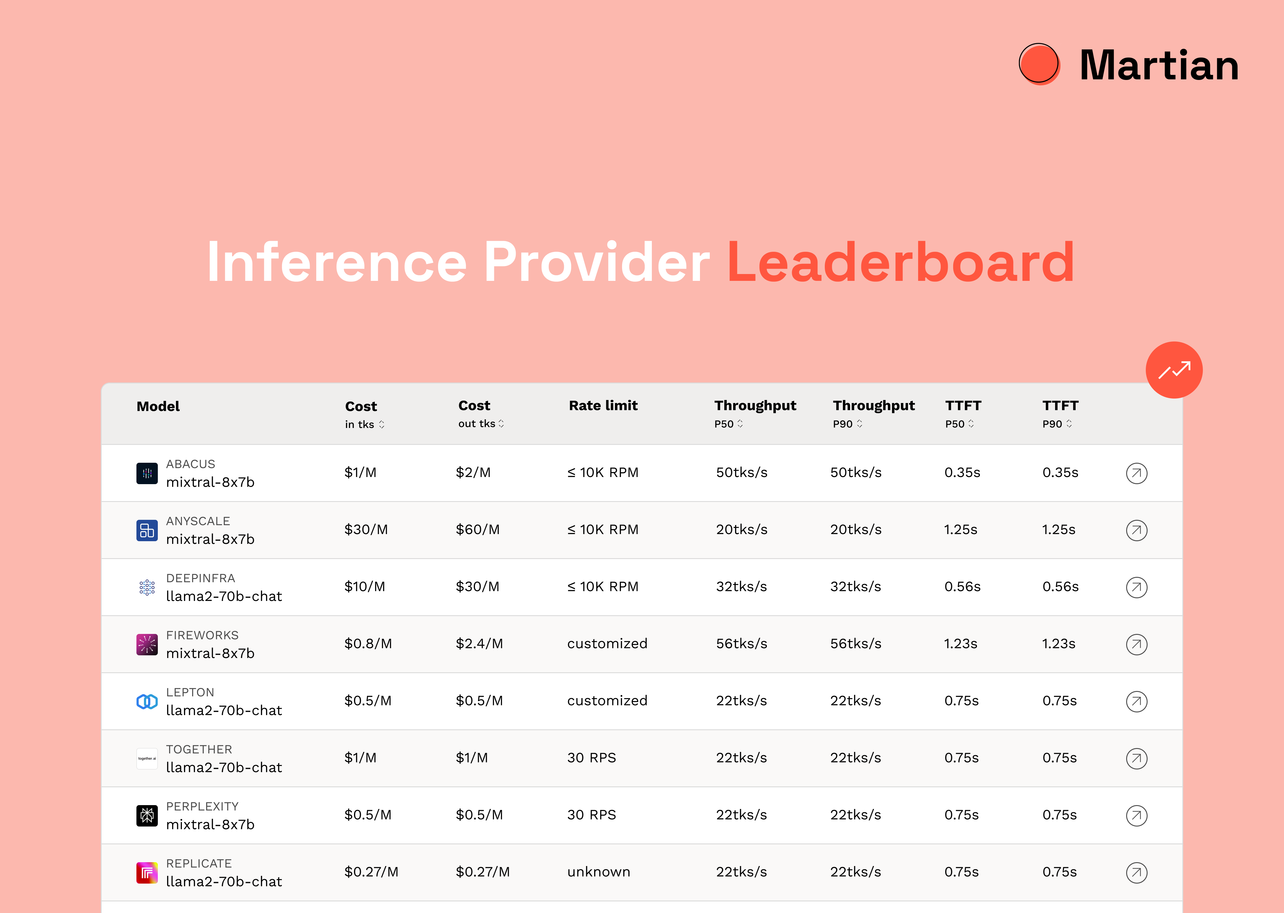
Inference Provider Leaderboard
There currently exists a lot of leaderboard platforms that rank individual LLM models such as GPT and Claude, however, there isn’t any platform that ranks providers according to specific parameters such as length of output tokens and number of concurrent requests made on the system. We wanted to create the first LLM inference provider leaderboard for users to be able to compare features across different models to make an informed decision.
business goal 1
Build Trust
with Users
Providing a leaderboard of different providers would help in building trust between potential and current users with Martian, and would highlight the fact that Martian is a leading startup in AI, specifically, in LLMs providers.
1
business goal 2
Marketing
Strategy
Another reason of creating the leaderboard was to provide more upfront value to users and market the actual product Martian offers, a subscription based model.
2
business goal 3
Provider
Relationships
Lastly, the leaderboard allowed Martian to connect with providers such as Lepton, Abacus, etc. and build a relationship with them. This would also likely result in providers coming to Martian if and when they have new updates.
3
Research
Before I could begin my research, I had to understand the different parameters we were providing our users, and more importantly, what each parameter meant for me to be able to visually and functionally design them. Once I researched each parameter as well as discussed with the software engineer on this project, I was able to ideate and explore more.
Service load
Rate limit
Output token length
Throughput
Endpoint format
Reliability rate
Time to first token
Input token length
Initial Challenge
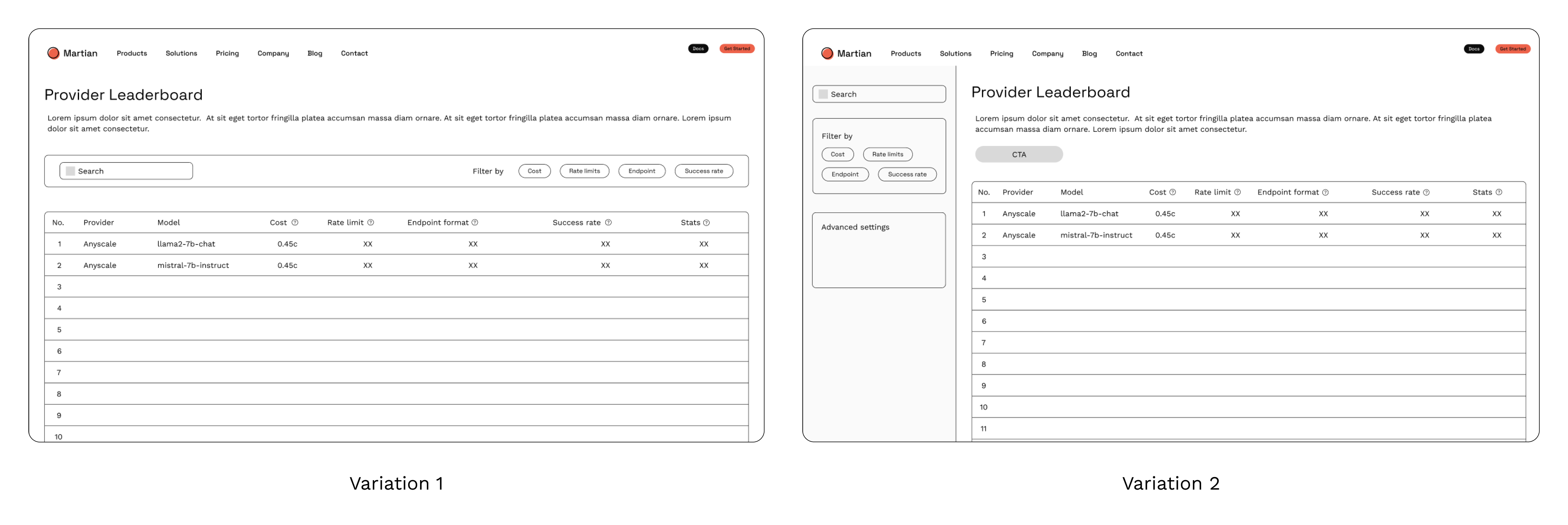
The biggest challenge was presenting a lot of information and data in an intuitive and visually appealing manner, consistent with Martian's branding. A lot of my research was inspired by cryptocurrency leaderboards - they presented a lot of information (numbers and metrics) that we needed to include in our table. As the timeline was tight, I began sketching and created low-fidelity wireframes about possible ideas I had.
There were some challenges with the initial wireframes.
(1) We wanted to provide users with as much information as possible and so I put information icons next to each parameter such as rate limit and endpoint format. However, according to research, signifiers shouldn't be used too much as their over-usage tends to overwhelm users. We established that the target audience would be users interested in LLMs and so they would be aware of these keywords. Additionally, we decided to add a link to the documentation page for users interested in learning more about these operational definitions.
(2) Using buttons for parameters would mean that users would have to go through a potential modal pop-up to set these parameters. This would not only increase user effort but would also make the design less intuitive. The key here is to design based on users' existing schemas (mental representations) and to leverage existing conceptual models that the user is familiar with.
The Solution
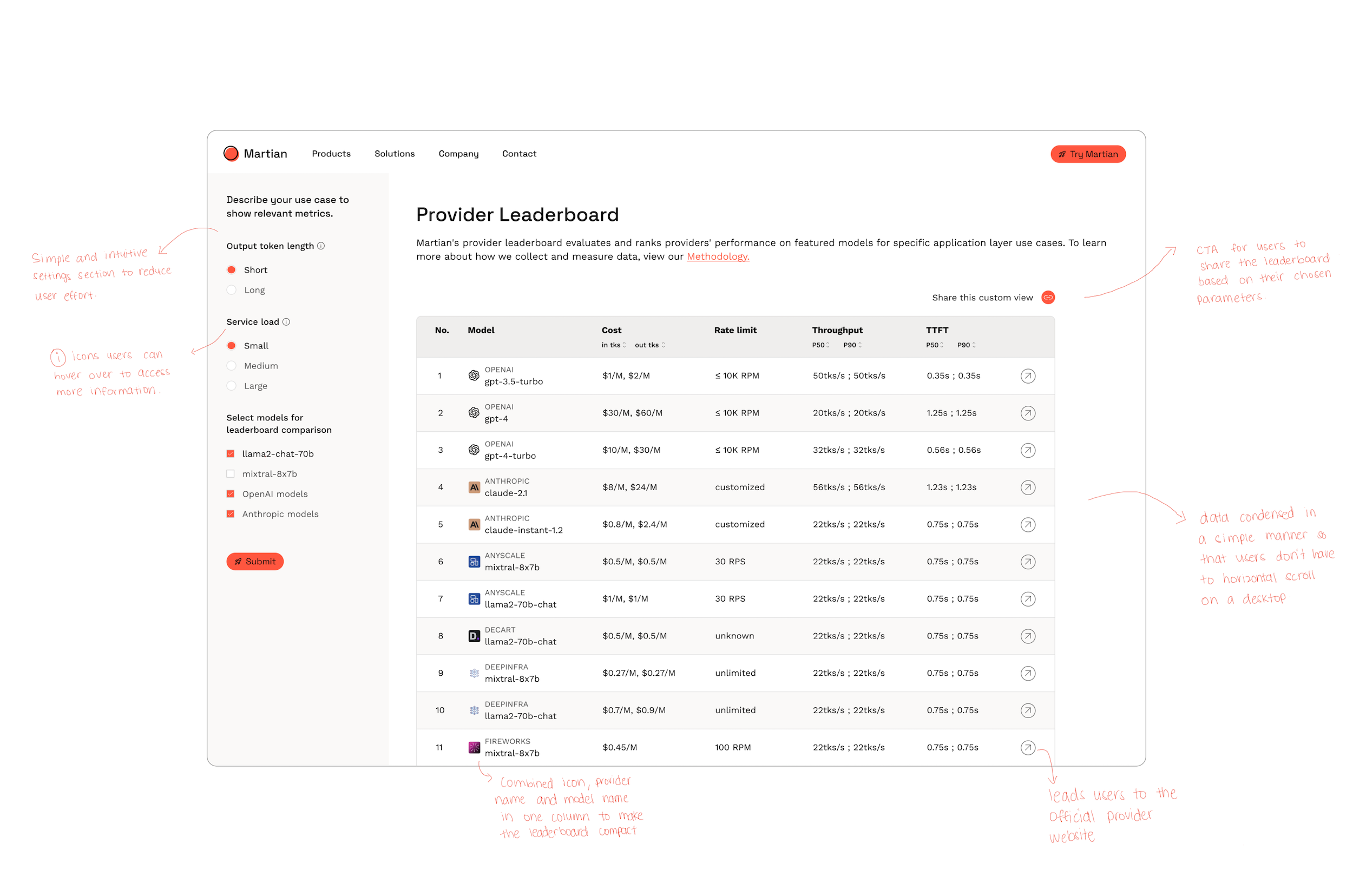
The final leaderboard has various features that work well:
1. Parameter settings section: This section is simple and intuitive, thus reducing user effort. Information or 'i' icons were added beside two of the parameters so that users have an idea of the metrics Martian use to operationally define the parameters.
2. Sharing custom view: This feature allows users to share the results of the leaderboard based on the metrics they have chosen.
3. Colour scheme in table: According to research, alternating data row colours increases readability. As the table has a lot of numbers and information, increasing readability for users was a high priority while designing it.
Design Decisions
Designing the Parameters Settings Section
The settings section was the one of the most important sections in designing the leaderboard as this was where users would interact with various options to load up the leaderboard with their preferred variables. Initially, I designed a few variations such as containers and drop-down menus for this section.
I ended up choosing V1 - Vertical for two main reasons: (1) it occupied lesser real-estate on the screen, meaning that the leaderboard would have higher visibility and (2) in terms of responsiveness, vertically aligned options fit better. Overall, V1 - Vertical was simple, intuitive and required lesser user effort when compared to the other drop-down menu options. As most questions consisted of selecting a single variable, I used radio buttons to make this choice more intuitive.
Provider Information
We also wanted users to be able to go to the provider’s official website through the leaderboard if they wanted to. I explored a few variations and initially we decided to go with the black underline over hover interaction. However, when I began creating a mobile responsive version, the most intuitive design in mobile would be that of the arrow, and so to maintain consistency, we ended up choosing the upward arrow version.
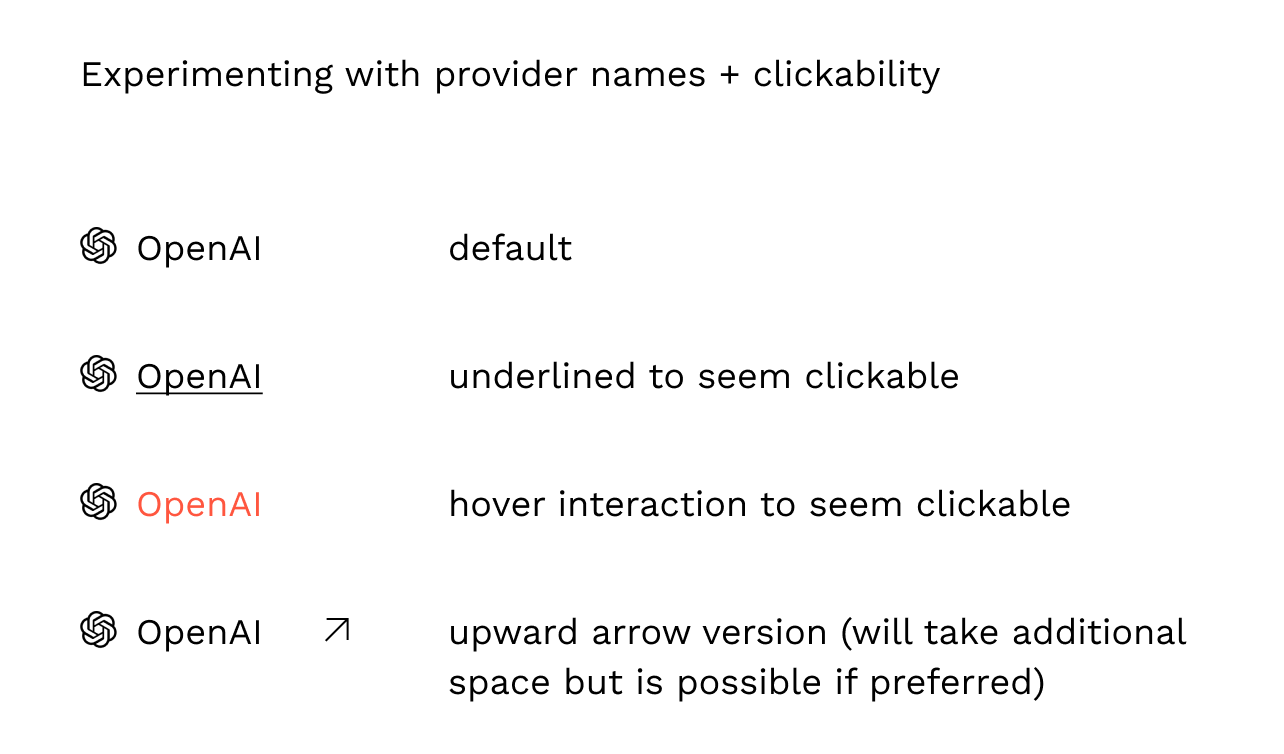
Additionally, our main objective was to increase the time users spent on the leaderboard, and therefore an initial black line hover functionality would direct users outside our website immediately. Thus, we decided to go with an upward arrow at the end very end of the table, also in a way highlighting that users would click on it if they wanted additional information.
Making it Mobile Responsive
Figuring out where and how to present the settings section in mobile view was a challenge we faced. The first iteration involved designing this section at the top enclosed in a container. However, a user would then have to scroll once or twice (depending on their mobile screen size) to get to the leaderboard. As the leaderboard was a marketing strategy, and as most users would perhaps initially open the leaderboard on their mobile first, we wanted them to instantly notice the leaderboard as soon as they opened it.
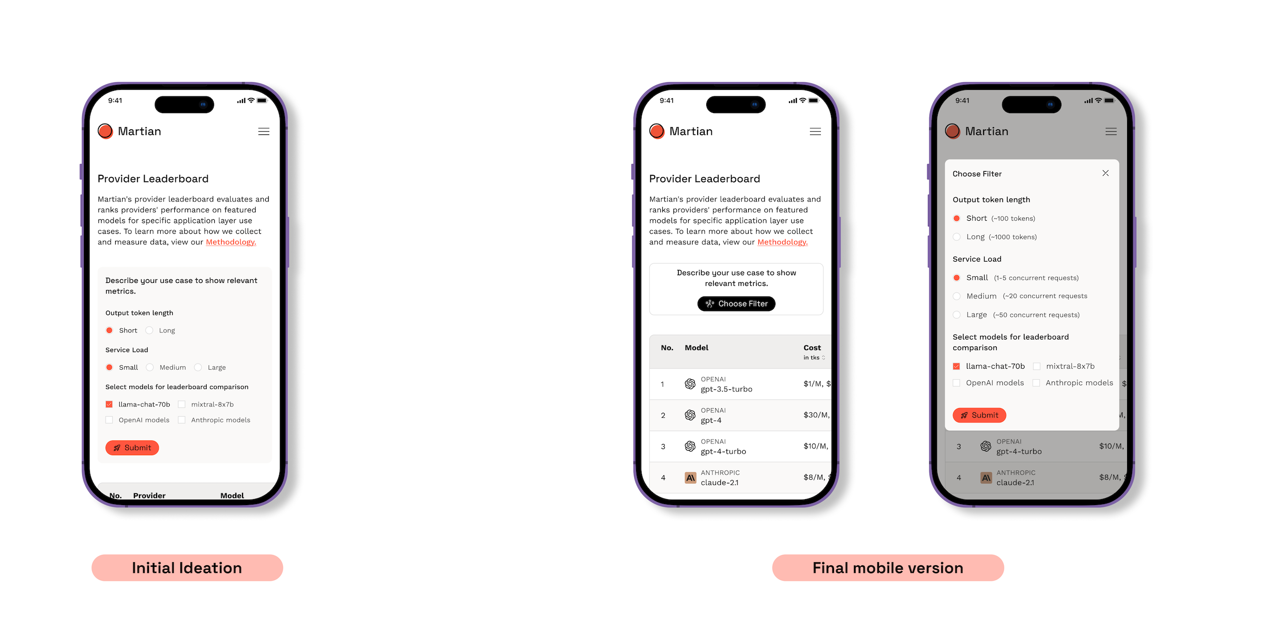
So, I switched gears and experimented with designing a modal pop-up for the settings section. The modal pop-up solved two problems:
1. It ensured that users saw a glimpse of the leaderboard when they opened it up
2. The info that was available to users when they hovered on desktop was included in the modal pop-up, ensuring that users using a laptop or mobile phone both had access to all the important information.
Feedback
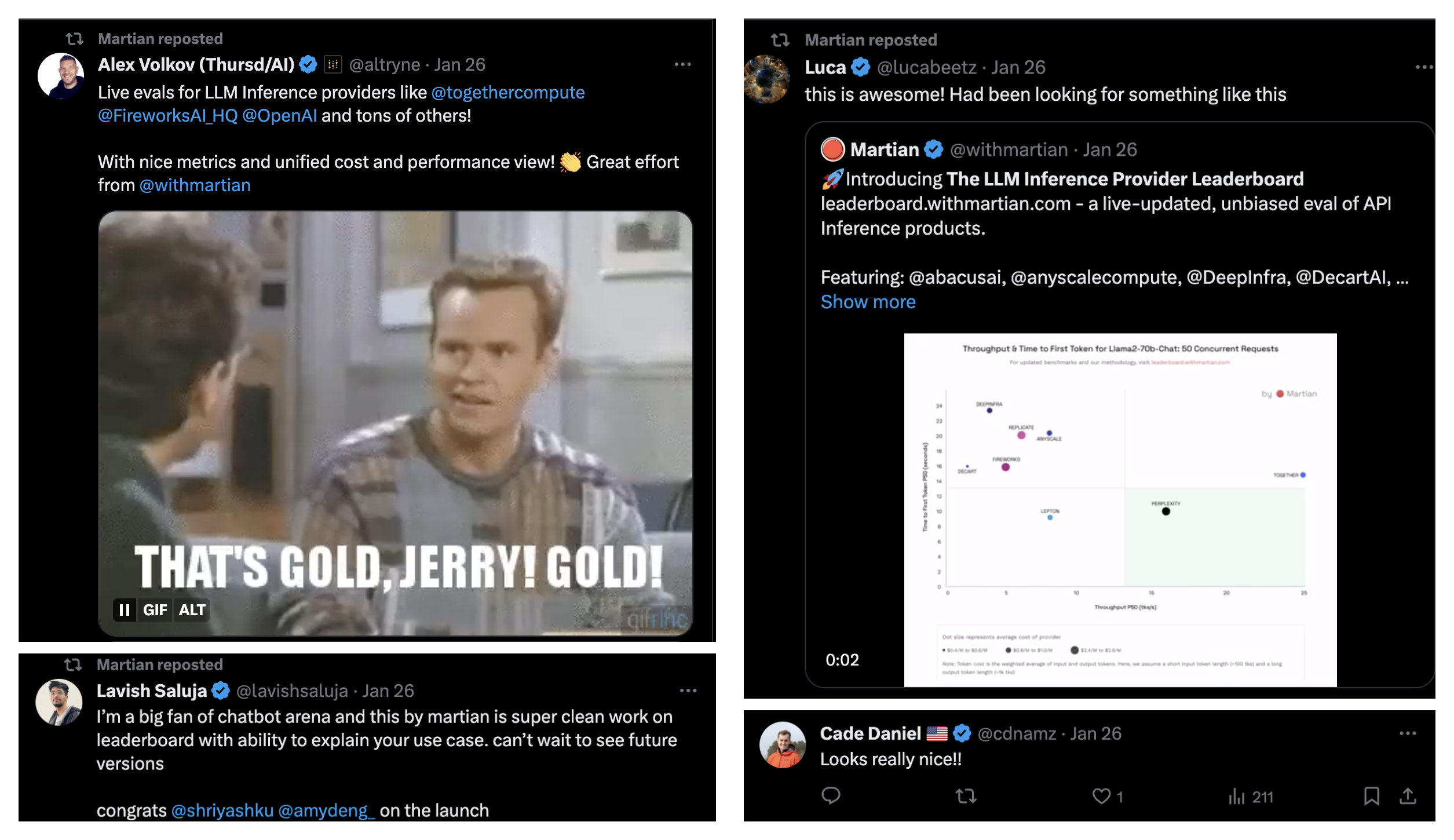
Overall, the leaderboard garnered a lot of attention and had some very great feedback. Users loved how clean and intuitive the design was and gained value from experimenting with it.